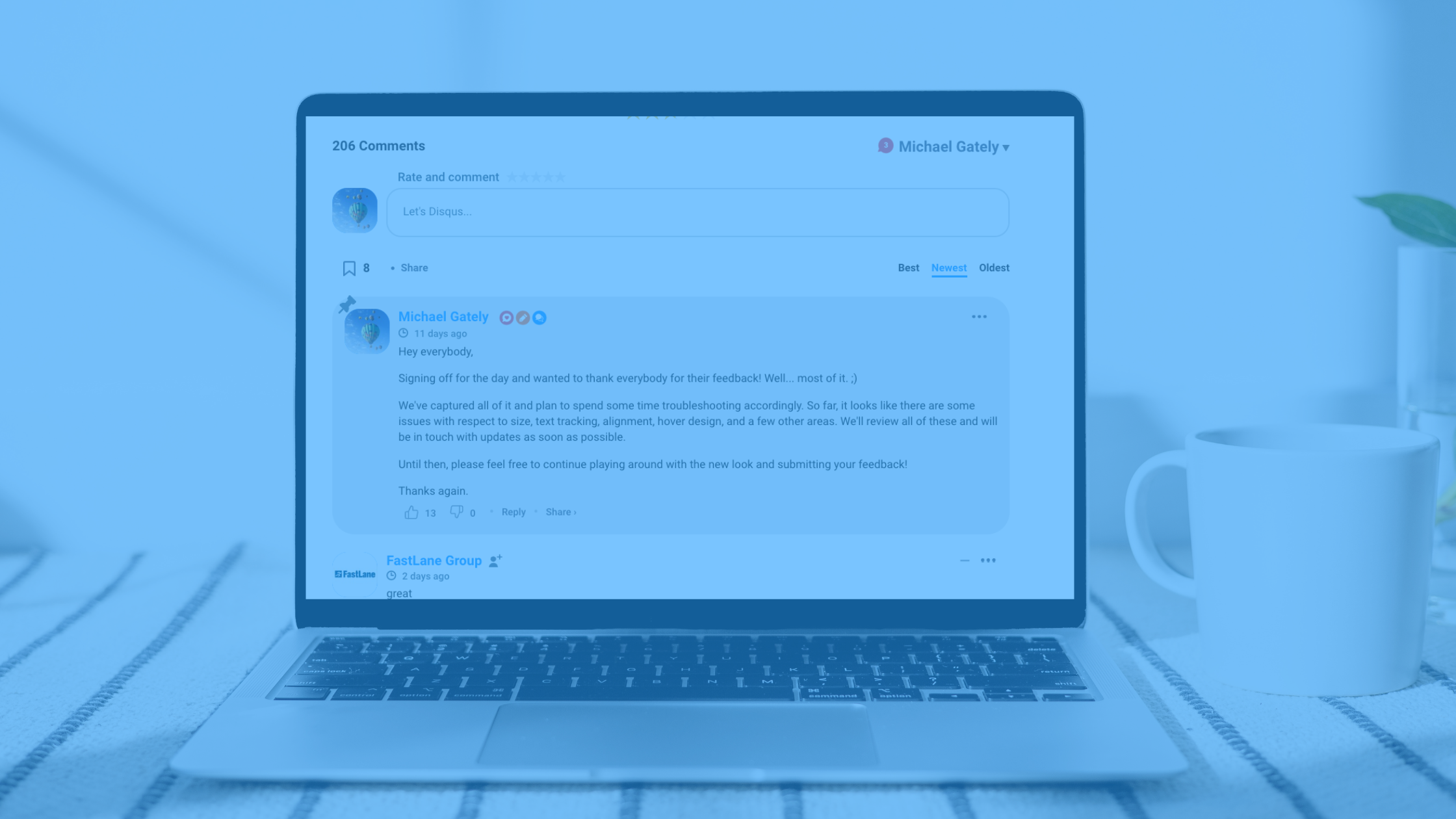
Last month, we announced that we were working on a refresh of the Disqus comment section.
Today, after weeks of listening to and incorporating tons of awesome feedback from our awesome community of commenters and publishers, we’re taking a huge step forward in fully deploying the new comment section across our entire network. It's a very exciting day!
From the beginning, the main objectives of our refresh have been threefold:
- To make Disqus more welcoming and engagement-friendly
- To modernize the comment section's look & feel
- To do a better job of integrating the comment section with publisher content and branding
We've taken a very intentional approach to our redesign. At each step of the way, when evaluating a proposed change, we asked ourselves one simple question: "will this improve the experience for our commenters and publishers?" If we couldn't immediately answer "Yes, absolutely"—we moved on. That's why you'll notice that the areas of core functionality—comment section navigation, how to log in and post comments/replies, where main features are located, etc.—have, by and large, been left unchanged. If it wasn't broken, we didn't fix it.
All of that being said, we are incredibly stoked to talk a little bit about what has changed. Let's dig in.
What's different?
We've sorted the changes into the following three general categories:
- Design
This is the area in which you'll notice the most improvements, including bigger avatars for greater viewability, new looks for upvote/downvote and Favorite Discussion icons, and slightly larger fonts for display names and comments. In addition to other subtle aesthetic touch-ups throughout the embed, we've also enabled more seamless integration between our comment section and the visual style of our publishers' websites via greater incorporation of the publisher's color palette into various design elements.
- Organization
Organizational upgrades include surfacing each embed sort order option for greater ease of use, moving the social share options and Privacy Policy to decrease clutter, and bringing the Featured Comment down beneath the postbox in order to make leaving a new comment the top priority.
- Functionality
First and foremost, the Comment Policy box now has a button that commenters can click to confirm that they've read and agreed to the terms. By clicking the button, users can dismiss the box moving forward for a cleaner experience for returning users. Other subtle changes to functionality include new formatting for Reactions and Custom Reactions, and making it possible to follow other users directly from the comment embed.
For a quick FAQ regarding the new design, please visit here.
What’s next?
Our work doesn’t stop here! We’re going to continue iterating and collecting feedback, and we’ll be rolling out further improvements in the days and weeks ahead. Please keep the feedback coming! Feel free to drop a comment below or reach out to us via email at anytime.
We believe that these updates will make for an improved overall experience for commenters and publishers. This is just the beginning of a greater effort to ensure that Disqus remains the engagement platform of choice for publishers in 2023 and beyond. We've got so much more on the way.
Thank you!
- The Disqus Team