Newsletters are a powerful tool that can turn casual readers into loyal audience members. They are designed to remind readers of your site, give them the 4-1-1 on what you’re up to, and encourage them to come back. When executed correctly, they can create a long lasting link between publishers and their audience 💌. Executed poorly, however, and newsletters are no longer your greatest ally, instead causing annoyance and frustration amongst subscribers. Don’t worry, though-- there are a few things you can do to enhance your newsletter strategy, and I’m here to tell you how!
Email newsletters can reach thousands of people with the click of a button, so investments in this type of content can really pay off. The average open rate of newsletters is approximately 15%-20%, which may seem low, but depending on how many people that newsletter is sent to, it can really add up. In case you need more convincing, really successful newsletters can experience significantly higher percentages, like TheSkimm, boasting an open rate of around 50%!
While marketing initiatives targeted at social media are the talk of the town (and are certainly important in any publisher strategy), there’s something to be said for those that have stood the test of time, like email newsletters. And, surprisingly enough, 73% of Millennials (the social media pioneers) actually prefer businesses to communicate over email. In this post, we’re taking it back to basics to discuss ways publishers can elevate their newsletter tactics.

Subject Lines
We’ll start with subject lines because they’re the first thing a subscriber sees and they play a big role in determining whether or not your email is opened or finds itself in the trash. Subject lines should be short and to the point, making sure the entire text is readable. They should clearly convey what to expect in this newsletter and why the recipient should open it. Adding exclamation points can help convey a sense of excitement and importance. Emojis are also an effective addition--in fact, 56% of brands that use an emoji in their headline experience higher open rates 🤩. However, it's important be cautious when using exclamation marks and emojis to avoid looking unprofessional or chaotic.
For example, the subject of this email newsletter from The Chive is clear and to the point. The pop of color from the phone and winking emoji catch the eye and help the email stand out.

Visuals
Images, videos, GIFs, emojis, graphics and other visuals are an email newsletter’s best friend. Email attention spans are around 11 seconds, so you don’t have much time to get through to your reader. Not only will visuals help catch your audience’s attention, but they will also quickly convey your message, so even those who are just briefly skimming through will have some takeaways. In fact, emails with visuals such as GIFs, for example, are proven to increase engagement and conversion rates. Furthermore, they can help break up your newsletter so it doesn’t appear too text-heavy.
Upon the release of Blue Planet II, BBC sent out a predominantly visual email that mimicked the depths of the ocean, incorporating filming facts and secrets. The visuals in this newsletter are exciting and intriguing, and demonstrate a creative way to help build hype for the show’s release.
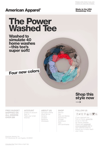
This American Apparel email presents another perfect example of the power of visuals. The motion of the visual is eye-catching and mesmerizing, as it mimics the movement of a washing machine to highlight the selling point of the t-shirts. Even a reader who quickly opens the email will have a general understanding of what it’s about and what makes it special.
Calls to Action
Calls to action give your reader a task to do and can easily direct them back to your site. There are many approaches to calls to action. They can be teasers (“want more?”), have a personalized feel (“you might also like…”), or anything else that will encourage a reader to click: “read more”, “shop now”, “it starts here”, you get the gist. Don’t be afraid to play around with wording, colors, fonts, sizing, etc. to make them stand out. Another tip--make sure your calls to action look clickable! If you’re using a button, make it stand out against the background with borders, shapes, and contrasting colors. If it’s a link, underline the text or change the color so it’s clearly visible.

The best part about calls to action: you can have one or you can put them everywhere, depending on your goals. If your newsletter covers multiple topics, you can have different calls to action placed throughout the body of the email. In the Goop example below, various calls to action indicate “read more”, “shop now”, “listen in” to give readers multiple opportunities to click back to the site. They also promote different aspects of the Goop brand including articles, product line, and their podcast.
The Body
Short and sweet is the name of the newsletter game. Think of newsletters as summaries--only include the necessary info! If you give away too much, there will be no reason for a reader to revisit your site. Furthermore, text-heavy newsletters can be overwhelming and deter readers who are just looking for a quick update or a fun read to pass the time on their train ride to work.
For emails with a more text heavy nature, including subheadings under the main section headers can make digesting the content a little easier. It also gives readers a better idea as to what a particular section is about before they fully dive in.
This email from Kitchn briefly summarizes the central article in a few sentences. The other articles highlighted have even shorter descriptions, keeping text at a minimum. The focus remains on the visual components and the call to action, helping keep readers engaged and directing them back to Kitchn’s site.
Structure
How you organize your newsletter is totally up to you and your objectives, but it’s important to make sure it flows in a clean, logical order. When online, people spend about 57% of their viewing time above the fold (the portion of the page that is visible without scrolling), so it’s a good idea to put the most important information and call to action first. You can also direct your readers where you want them by using size, color, position, contrast, and other visuals to draw attention to the most important aspects of your newsletter.
It can be beneficial to follow a similar outline each day or week to give readers some idea of what to expect. This familiarity will make it easy for them to follow along and get the most out of each piece.
TheSkimm sends out a daily email summarizing the most recent news stories. Each email follows the same layout, making it easy to navigate through all of the text. To start, they provide a visual followed by a daily quote, continuing with several relevant news stories. At the end, there’s brand promotional categories, including product recommendations and reader spotlights. The consistency and logical structure of TheSkimm certainly adds to their appeal.
Interaction
Everyone likes to feel included, and adding interactive elements like quizzes, polls, image rollovers, and buttons to your emails gives your readers the opportunity to take action. Creating interactive email experiences is at the top of a lot of marketers lists of things to do because it’s a great way to engage audiences and secure more of their attention. Furthermore, a good chunk of email reading (at least 50%, if you want to get technical) is done on mobile devices, where users are already swiping, scrolling, and clicking. Adding opportunities for people to give input by tapping their screens (or clicking their mouse) is a fun addition for everyone!
Xfinity thought so too! They included an active poll in an email promoting Watchathon Week, asking readers to choose which show they would binge first.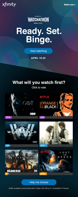
Putting it all together
Combining and using these elements in different ways will allow you to design your emails to execute your objectives. Whether that be announcing an upcoming sale, the release of a new product or event, or promoting new blog posts or articles, there are various ways to match your newsletter to your brand and goals.
What’s your favorite email newsletter? What does it do well? 💬